This is my music in the online age Prezi that I have just finished.Since I used Prezi last, it has changed it's layout to create a better simpler system. I think it works well, but it's still time consuming getting the path correct. I have to say I do like the new layout and improvements Prezi has made, and the presentations do look good. I think if there was to be one improvement it would be including more design templates.
Monday, 14 May 2012
Coursework development over the year and important links.
This year for our media coursework, we chose to
create an indie music video. The song chosen was ‘Blue Skies’ by the band ‘Noah
+ the Whale’. One member of our group and I, knew quite a lot about the indie
genre because we liked this type of music. We had created a mind map of
different bands, such as Mumford and Sons, but in the end we voted on Noah and
the Whale because we felt the song could be explored in terms of themes more.
In addition we also created an advertisement campaign, which consisted of a
magazine album promotion page, along with the albums digipak. We used Apple
Mac’s for our editing and Final Cut pro in particular. There has been a lot of
independent research and planning before the filming actually started; some of
use also created a preliminary music video, which can be found here, http://www.youtube.com/watch?v=tMK5JhwDF-8&feature=plcp.
My research and planning can be found here, http://musicvideoalevel.blogspot.co.uk/search/label/Research%20%2B%20Planning
Also my Evaluation work can be found here- http://musicvideoalevel.blogspot.co.uk/search/label/Evaluation.
I also have a PowerPoint on Scribd; http://www.scribd.com/doc/93047384/Media-Evaluation.
If you would like to take a look at our YouTube
channel, where we have uploaded our videos, this is the link. http://www.youtube.com/user/RHMGubloid?feature=mhee
.
Thursday, 10 May 2012
Final Cut Pro and Editing anaylsis- Question 4 How did you use media technologies in the construction and research, planning and evaluation stages?
These are the screen shots that Radhika and I took from the Apple Mac's. It shows our project that we were creating, with us discussing the editing techniques we used, accompanied with the shots of the edited visuals that we were talking about. However this video didn't render all together for some reason, so we're going to upload the video of us talking, along with some stills, as examples. It's unfortunate that this didn't work, because it would have been a good video altogether.
The screen shots show the format of final cut Pro, and the software that we used.
The video below is an in depth analysis of how we used editing In our video and which sections the effects were used on.
I like making videos like this, because lots of people prefer to watch videos rather than read long articles on how we did it. Visual images, in my opinion are far better than written work. Also seen as this is a media blog, I think it's more creative to make videos!
Be warned this video is loud! I underestimated and forgot how clearly the Mac's picked up our voices.
Preliminary Evaluation
Initially our group decided to answer the four evaluation questions in pairs. So we split up and discussed the questions and what we did to conform to the genre, the feedback we received and how we listened to this. In addition we explored how we used planning and research to help us, as well as the technologies we used throughout our coursework.
After this evaluation, we have done individual analysis aswell.
The first video featuring Radhika, explains how
we challenged or conformed to the Indie genre.
Question 3
What have you learnt from your audience feedback?
Radhika and I discussed what we learnt from the
audience feedback and how we changed our video, from some of the improvements
suggested. The audience feedback was primarily obtained through our showcase
evening, because we had such a huge amount of people. The feedback forms were
divided equally through the group and then the data was analysed.
Question 4
How did you use media technologies in the
construction and research, planning and evaluation stages?
This video features Mark and I. I think I talked
a lot though this video, probably because I knew the systems we were using, as
Mark didn't actually use Final Cut Pro. Marissa added in some great images of
our ancillary task, which flowed well with this video. Initially our group
spilt into two's to talk about the 4 evaluation questions, but after some
consideration we decided to do the 4 questions together on the Apple Mac's, on Photo
booth. Finally one more thing to add - This video was improvised because we
wanted to have a general discussion.
Then Marissa discussed how our ancillary texts
link with our music video.
Drafting Analysis
This is the draft that Radhika and I discussed in our media
lesson. I helped by explaining the order of the filming and editing that we
done, from this Radhika devised this drafting analysis. I think it explains in
detail the amount of effort we put into our 'Oliver Fox' video piece, as we
spent a great deal of time, filming and selecting the best shots and then
editing them in the appropriate place. It also shows the improvements we made and why we did these.
Drafting Analysis
Wednesday, 9 May 2012
Tuesday, 1 May 2012
Group Evaluation
This is our group evaluation, we had a discussion on the 4 questions, but this was pretty short because we are each creating 6-9 slides on one of these questions. We discussed the feedback we received from our showcase evening, and the main positives and negatives of the music video piece. We briefly touched on the technologies we have used this year, and how they have progressed from last year. We generally talked about what went wrong and right.
Having thought about this group evaluation, we considered how tricky it would be for each of us to only contribute to one question, therefore we have decided to individually do the written/PowerPoint evaluation, but we still had a group discussion in addition to this.
Having thought about this group evaluation, we considered how tricky it would be for each of us to only contribute to one question, therefore we have decided to individually do the written/PowerPoint evaluation, but we still had a group discussion in addition to this.
Monday, 30 April 2012
Scribd
I love Scribd. I've only just uploaded 2 documents and within seconds I've had 13 reads. I can't believe it! I've stated my blog on my profile on Scribd, so hopefully that will attract more people from that site to here.
Question 4- How did you use media technologies in the construction and research, planning and evaluation stages?
This is the PowerPoint I had made for question 4, when we thought each group member was taking a question and preparing their parts of the evaluation. However we didn't do this but I've still kept this initial post about 'Media Technologies' that I had devised. From the feedback I had received I knew I had to include more information on Final Cut Pro, so I have updated this PowerPoint, with lots of slides on FCP, and how I used it and what specific effects I used. This can be found on my Final evaluation blog post.
Question 4- How Did You Use Media Technologies
Sunday, 29 April 2012
Ancillary Task; Magazine Advert
This is our final designs of the magazine advert, we had to construct for our ancillary task. Marissa did most of the piecing together of the adverts, the font, and page design was primarily done by her, however I did provide some of the images. The first image was actually taken of Jonathon at my 18th Birthday party. I had taken the shot with my friends camera and I didn't really know how to use it so I was experimenting with the many different settings, and I managed to take this really cool shot. The second image was taken on our groups bloggie camera, I think I took this particular shot, but I could be wrong and it might be Marissa. Either way there was only the two of us on the day, so it was taken by one of us. I think the font used for the adverts works really well, as it stands out straight away. It states all the information needed. I also like the way the N has been back-to-front, it does make this unusual and quirky. I also love the way the second advert has been constructed.
Friday, 27 April 2012
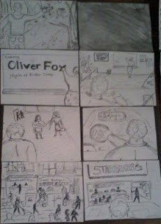
Final storyboard
This is our final storyboard for the Oliver Fox- Nights of a broken sleep video. The very artistic drawings are by Marissa. I must add that we didn't follow the storyboard completely because we felt that we needed a lot more performance based shots, rather than just a solid narrative. I don't think I've seen a straight narrative in a music video, without cameos from the artist. Therefore we knew we had to change a few things, but this was a good outline.
This doesn't include every shot that we took, because some were spontaneous. Also Radhika and I devised a list of shots we had to include in the video separately, that we took to filming.
Actors
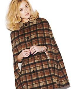
The actors involved I feel, fit the indie style perfectly (even if i say so myself as an actor) and from some of the feedback we received during the showcase evening, so did the audience. I just wanted to write a short blog post about our actors and include some images of us. As you can tell we're all rocking geek glasses! Has to be done. Jonathon wore virtually the same clothing, and as you can't see what I'm wearing I'll describe it to you. I wore black leggings, camel coloured boots, a Beatles t-shirt, and a camel coloured jacket. I felt we looked like indie kids, because we kinda are.
Because you couldn't see what I wore, I decided to take some pictures of it at home. I placed the clothes on a manikin, so it might look a bit weird.
 |
| This is Jonathon, well known for his classic gentleman style |
 |
| This is a beautiful image I took of him last year, he hasn't changed much though |
 |
| This is me (Hannah) |
 | ||
 |
The construction of the DigiPak
 | ||||
| This was a new |
Marissa really liked these images, and she managed to incorporate them into the first digipak design and also the final design.
The image of the baby calf was included in the final digipak design, it can be seen on the far right hand side of the front cover.
The swarm of fish image, was also included.
In addition the image of myself at the bottom of the post, and the shot of the beach with colourful stones, and mountains in the background was added.
Marissa also took inspiration from Vincent Van Gogh's famous painting 'Starry Night', and Salvador Dali's red rose, which were included as well; we thought the romantic theme the artists transmit fit well with the narrative of our video piece. The inclusion of the sleeping pills, is relevant to the theme of the single we were promoting, 'Nights of Broken Sleep', we thought this was a really nice touch.
 |
| The view from the garden |


This is one of my favourite images and Marissa agreed. I loved the colours of the pebbles on the beach and the overcast day, with the views of islands in the distance.
With the combination of images, Marissa created a beautiful piece of art work.
 |
| By Salvador Dali |
 |
| Vincent Van Gogh's 'Starry Night' painting |
 |
| Sleeping pills |
Tuesday 3rd April Filming
I realised I forgot to post about our last filming session of Tuesday 3rd April. We filmed at a local shopping centre because this was one of our initial ideas on our storyboard, it establishes the part of the kidnapping and this was essential to get.
All members of the group came along. It was really good to have everyone together because we all have varied ideas, and these ideas work better when everyone contributes. Jonathon was our actor and I was the actress, Marissa and Radhika were the extras in this particular scene, so Mark was filming. Although half way through filming the camera ran out of battery, luckily I had my camera on me, which has HD video recording, so we used this for the rest of the shots. We managed to get all the footage we needed done, to fill the 30 second gap.
All members of the group came along. It was really good to have everyone together because we all have varied ideas, and these ideas work better when everyone contributes. Jonathon was our actor and I was the actress, Marissa and Radhika were the extras in this particular scene, so Mark was filming. Although half way through filming the camera ran out of battery, luckily I had my camera on me, which has HD video recording, so we used this for the rest of the shots. We managed to get all the footage we needed done, to fill the 30 second gap.
Monday, 23 April 2012
Final A2 Music Video
This is our final A2 music video, 'Oliver Fox- Nights of broken sleep' which we have been working on for nearly a whole year. The time has passed so quick!
Overall I'm really pleased with the outcome of the video and I feel we have stuck to the genre and completely changed the narrative, instead of following a similar theme. We have completely devised this concept from scratch and personally I've dedicated so much time to this one project. I hope people like this and you can comment your heart out on it : )
Audience feedback from the showcase evening
- We had an overwhelming positive response from our written audience feedback, taken during our showcase evening. The questions that received high levels of encouragement were the choice of setting, the narrative of the video in fitting with the song, the editing was also something that a number of people highlighted as excellent and the use of camera angles. We had a large number of written responses; therefore our group decided it would be easier to divide them evenly. I ended up with all my sheets being between the age of 0-20 and it was fairly spit from there in terms of gender. Also none of my feedback forms stated they enjoyed listening to Indie music regularly or that Indie was their favourite type of music, instead most people stated their favourite genre of music was R&B, Pop, dance and two people liked rock music. However from the 18 response forms 14 people left a mark out of 10 and this averaged an 8. We scored an even better 9/10 from Radhika’sresearch.
Some negatives that we picked up on were-
- A lot of feedback referred to the change in the main character’s appearance, as he cut his hair. We couldn’tcontrol the fact that our actor decided to cut his hair, it was his individual choice and we understand this may have looked unrealistic, but in defence it’squite clearly the same boy.
 |
| The White Stripes |
- Some comments praised the choice of costume, suggesting it ‘fitted well’ however not everyone agreed we had one comment suggesting that the boy shouldn’t have worn a suit. Although given that our genre was indie, we decided that suit’s would work well because it is typical of the genre. We put a lot of thought and background research into costume and it certainly wasn’t a case of whatever he was wearing on the day. We tried to be consistent, even when filming on different days; we dressed the same or in similar clothing.
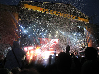
- I wanted to include some images of the Killers because they are a good example of an indie band that dresses smartly. The Killers images were taken by me, at Hard Rock Calling last summer, and it was pouring down with rain, so I didn't manage to get the best quality images. The Killers always dress smart in a way it's like their trade mark, when I saw them live, Brandon Flowers the lead singer was even wearing a suit.
- Some comments suggested we needed a more isolated area for the main kidnapping scene; some felt the park was too open. This was definitely a fair point; however we may have corrected this issue, from editing this scene.

-
One individual picked up on the unrealistic nature of the gun prop and we would agree that the gun prop looked unrealistic however in conversation with a shop owner who sold the toy guns, we found due to gun crime, the government did not want to promote these weapons and they are commonly found in bright colours, instead of looking realistic. We tried to help this issue by only showing glimpses of the weapon and not including it much in the video. In 2001 toy guns were the height of debate, and the minister at the time, Charles Clarke said replicas posed a "real threat" to society. I even have an image of him, holding both a replica gun and a real gun.I guess the big negative point we will have in our evaluation, is the unrealistic nature of the gun, and if we was to do this again, we would spray paint it.
- Positives
We had a number of good comments about the editing and how well it was constructed; we were really happy with these comments, because we put a lot of effort into this particular area.Although the video that was shown on the showcase night was a draft and we had corrected some of our previous mistakes, take for example the critical scene at the end where the boy shoots the girl. We found that the location needed to be in the background more given that, it was in a public park and not the most inconspicuous place, therefore we changed the sequence and made the characters facial expressions more dominant in the shot selection, with quick editing of the action taking place, this also didn’t include any shots with dog walkers in the background. This is something that the audience fed back to us, having seen the draft. We did feel the reality was lost in the shot where dog walkers could be seen, and we’re quite happy that we have taken this out. - I found a number of comments relaying the good choice in characters, they seemed to think the actors fit well with the genre, in terms of appearance and costume choice.
- A couple of people said they found the concept easy to understand and gripped them straight away. One person said ‘There was a lot of suspense, it made me intrigued. The stalking part was pulled off really well.’
- However some people didn’t manage to understand the concept of the narrative, but it’s fair to say from the feedback the majority of people did. Overall when evaluating all feedback forms,including those of other members of my group, I found that the younger individuals that we asked to evaluate the piece didn’t seem to understand the themes of the narrative, as much as older individuals. We asked a class of year sevens and eights to answer the feedback form, and this age group seemed to be the ones struggling with the themes of the narrative. However seen as the target audience was mainly 15-30 year olds, and indie music lovers, we wasn't too concerned about their lack of understanding for mature themes.
- We also included more performance based shots that we initially thought we would, however in our opinion we thought they worked well.
Sunday, 22 April 2012
Final full digipak with analysis
This is our combined digipak,
with everyone's section. I think it works well with the colour scheme, it
doesn't over power the imagery, nor is it unnoticeable. It fits well. I like the addition of the artist in the bottom left panel, I took this picture on one of our filming days, with Radhika, during early December last year. The black and white looks great with the rest of the panels.
Initially I had devised two back panels for the digipak, and I asked the group which design they thought was better. We decided on the one we have included because it's quite easy to read the writing unlike the other design I made.
The other design was this.
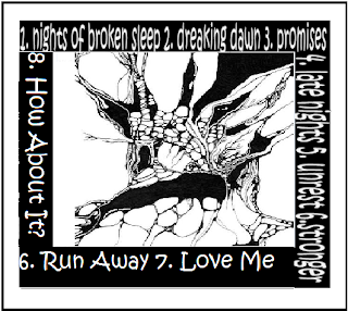
I liked the thought of the writing around the outside, because I thought it looked more artistic and Indie. However I felt it was hard to read. Also the font was originally the same, however I saved this design onto my memory stick which I lost, so that really wasn't a help. I then found a half completed design of this on the school's computer system, I then gave it to Radhika to save on her memory stick and she added in the different writing. I had found the images, which were sourced online, and I also decided on this font, which I believe was 'Kristen ICT' on word. I wanted to give the impression of child like hand writing, which you can see with the top panel of writing and right hand side. Both do not use capital letters unlike the later addition of Radhika's writing. I had also initially written a blog post on these ideas, under the title of storyboarding. I had thought of a black box like this with writing around it and an image in the middle. I had also contemplated doing something with the front panel, with block letters of our artists name 'Oliver Fox' and his song 'Nights of broken sleep', I had taken inspiration for this idea from The Drums album cover, which can be found under the blog post on digipak inspiration.
I wanted to maintain the black and white theme throughout; because it linked to our dark themes of our music video and I also felt black and white was a convention that some Indie artists often used. The image that I designed for the back panel looks like a heart to me, which I thought represented some of the love themes in our music video, In addition to linking to the lyrics, 'This is a song for anyone with a broken heart'
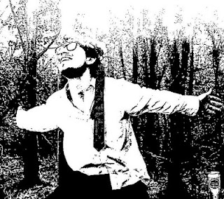 The image of our artist in
the bottom left hand side of the digipak and above, was taken by me in colour and converted into black and white; I loved this image and
thought it would work perfectly. I thought we needed to include an image of our
artist; otherwise the album wouldn't really fit the conventions of typical
albums. I also thought that the top middle panel should have been replaced by
another image of our artist, because the album was becoming too abstract and
this could deter some customers from buying the album, as some people like to
see the artist. Also this picture in practically had no real meaning to our
piece, as it was just a river with some effects.
 Apart from that the overall digipak works well; the CD is well constructed and better than I imagined it would be like. The black CD, with pale blue roses fit so well. The font and design of the song titles flowed with the CD.
In addition to our digipak, we originally decided to create a website, however when researching this, we found that it may be harder to carry out than we initally thought. Especially because we didn't really know how to use the software. So we then decided to create a magazine advertisement. We created two of these campaigns that we would later add into NME Magazine,
After analysing the first one on the left, some of the group members, including myself thought this image looked too 'techno' for our genre, and that it didn't really fit, with the bright, colourful light rays, in comparrision to those I had researched, where they used pale colours, and interesting images.
However we did all agree this was well constructed and it would definitely stand out in a magazine. The second image on the right, in my opinion flows a lot better with the indie genre. A number of reasons made the second image better than the first, the use of instrument and interesting setting, makes a much better image, as you can see the artist. The effects used on the second one are better, as we have sectioned the image into parts, which makes the release date stand out more.
Subscribe to:
Comments (Atom)


