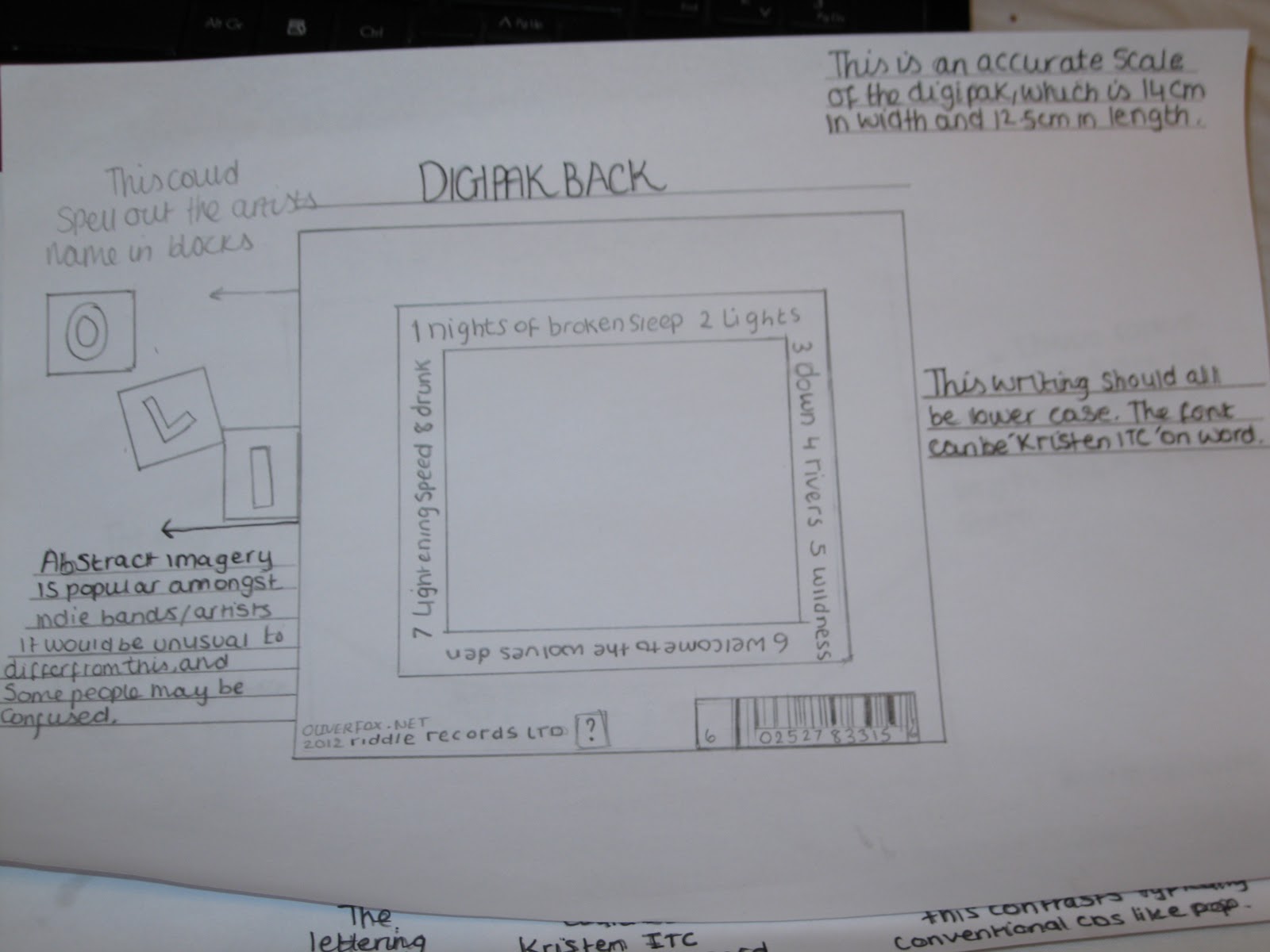
Showing posts with label Digipak. Show all posts

Friday, 27 April 2012

The construction of the DigiPak

This was a new

born calf, standing for the first time


The inspiration for the Digipak initially came from some images I had taken in Ireland. My grandad has a farm out there and I managed to capture some lovely images of the wildlife and nature.

Marissa really liked these images, and she managed to incorporate them into the first digipak design and also the final design.

The image of the baby calf was included in the final digipak design, it can be seen on the far right hand side of the front cover.
The swarm of  fish image, was also included.
In addition the image of myself at the bottom of the post, and the shot of the beach with colourful stones, and mountains in the background was added.
Marissa also took inspiration from Vincent Van Gogh's famous painting 'Starry Night', and Salvador Dali's red rose, which were included as well; we thought the romantic theme the artists transmit fit well with the narrative of our video piece. The inclusion of the sleeping pills, is relevant to the theme of the single we were promoting, 'Nights of Broken Sleep', we thought this was a really nice touch.

The view from the garden


This is one of my favourite images and Marissa agreed. I loved the colours of the pebbles on the beach and the overcast day, with the views of islands in the distance.

With the combination of images, Marissa created a beautiful piece of art work.


By Salvador Dali


Vincent Van Gogh's 'Starry Night' painting

Sleeping pills


Sunday, 22 April 2012

Final full digipak with analysis


This is our combined digipak, with everyone's section. I think it works well with the colour scheme, it doesn't over power the imagery, nor is it unnoticeable. It fits well. I like the addition of the artist in the bottom left panel, I took this picture on one of our filming days, with Radhika, during early December last year. The black and white looks great with the rest of the panels.


Initially I had devised two back panels for the digipak, and I asked the group which design they thought was better. We decided on the one we have included because it's quite easy to read the writing unlike the other design I made. 

The other design was this.


I liked the thought of the writing around the outside, because I thought it looked more artistic and Indie. However I felt it was hard to read. Also the font was originally the same, however I saved this design onto my memory stick which I lost, so that really wasn't a help. I then found a half completed design of this on the school's computer system, I then gave it to Radhika to save on her memory stick and she added in the different writing. I had found the images, which were sourced online, and I also decided on this font, which I believe was 'Kristen ICT' on word. I wanted to give the impression of child like hand writing, which you can see with the top panel of writing and right hand side. Both do not use capital letters unlike the later addition of Radhika's writing. I had also initially written a blog post on these ideas, under the title of storyboarding. I had thought of a black box like this with writing around it and an image in the middle. I had also contemplated doing something with the front panel, with block letters of our artists name 'Oliver Fox' and his song 'Nights of broken sleep', I had taken inspiration for this idea from The Drums album cover, which can be found under the blog post on digipak inspiration.

I wanted to maintain the black and white theme throughout; because it linked to our dark themes of our music video and I also felt black and white was a convention that some Indie artists often used. The image that I designed for the back panel looks like a heart to me, which I thought represented some of the love themes in our music video, In addition to linking to the lyrics, 'This is a song for anyone with a broken heart'


The image of our artist in the bottom left hand side of the digipak and above, was taken by me in colour and converted into black and white; I loved this image and thought it would work perfectly. I thought we needed to include an image of our artist; otherwise the album wouldn't really fit the conventions of typical albums. I also thought that the top middle panel should have been replaced by another image of our artist, because the album was becoming too abstract and this could deter some customers from buying the album, as some people like to see the artist. Also this picture in practically had no real meaning to our piece, as it was just a river with some effects. 
 Apart from that the overall digipak works well; the CD is well constructed and better than I imagined it would be like. The black CD, with pale blue roses fit so well. The font and design of the song titles flowed with the CD.


In addition to our digipak, we originally decided to create a website, however when researching this, we found that it may be harder to carry out than we initally thought. Especially because we didn't really know how to use the software. So we then decided to create a magazine advertisement. We created two of these campaigns that we would later add into NME Magazine,

After analysing the first one on the left, some of the group members, including myself thought this image looked too 'techno' for our genre, and that it didn't really fit, with the bright, colourful light rays, in comparrision to those I had researched, where they used pale colours, and interesting images.
However we did all agree this was well constructed and it would definitely stand out in a magazine. The second image on the right, in my opinion flows a lot better with the indie genre. A number of reasons made the second image better than the first, the use of instrument and interesting setting, makes a much better image, as you can see the artist. The effects used on the second one are better, as we have sectioned the image into parts, which makes the release date stand out more.

Final Digipak


This was one of the first designs I created.
During the digipak creation process, our group decided to each design a panel. We had the freedom to be creative and it allowed everyone to involve themselves. I'm really happy with the outcome, I think it looks fantastic and from the feedback we had from our media classmates, they also seemed to like it. Firstly I gave our group some ideas of stereotypical 'indie' CD's, some CD's I brought from home and others I grabbed from the internet as examples. This gave us an idea of how far artistically we could go, because the research showed us, band/artist images didn't necessarily take up 6 panels on a digipak. I took the back panel to design, Marissa took the front, Radhika took the middle, and Mark also took the middle. We decided that we needed a colour theme to stick to, primarily so that we could follow this theme in our other ancillary task (Magazine advert). We decided to keep to black and white and add hints of colour; these colours were to be used on wording. I spent a lot of time researching abstract black and white images and I was particularly drawn to images of the heart and arteries. I thought this related to the heartache of the song with the feelings of longing and undying love that the character had in the video. So this is why I chose the final back panel to be based around the black and white heart image. Marissa worked really well with editing and photo-shopping images; she twisted and played around with colours and designs. I gave her some images that I took whilst on holiday, and she played around with them and included them in her final panel, I thought they came across really well.
This is the final back panel design, with the colour scheme.

Wednesday, 1 February 2012

Digipak


This is a detailed plan of how the digipak will look. (Bear in mind this in an indie artist)

Firstly I have included a plan of what I expect to be on a digipak; this is useful as I can always look back at this, and see if I have missed out anything vital. 
I also have a structure plan of how the digipak will be pieced together and what the panels will have on them. 
In addition I have sketched out the front and back of the digipak, although the images are not on the pages as they will be displayed in the right hand column of this post.

This will be the digipak's front cover.

This may be inserted inside the digipak.


This will be on the back of the digipack, and it will be placed in the middle of the square with the track titles around it.