Sunday, 22 April 2012

Final Digipak


This was one of the first designs I created.
During the digipak creation process, our group decided to each design a panel. We had the freedom to be creative and it allowed everyone to involve themselves. I'm really happy with the outcome, I think it looks fantastic and from the feedback we had from our media classmates, they also seemed to like it. Firstly I gave our group some ideas of stereotypical 'indie' CD's, some CD's I brought from home and others I grabbed from the internet as examples. This gave us an idea of how far artistically we could go, because the research showed us, band/artist images didn't necessarily take up 6 panels on a digipak. I took the back panel to design, Marissa took the front, Radhika took the middle, and Mark also took the middle. We decided that we needed a colour theme to stick to, primarily so that we could follow this theme in our other ancillary task (Magazine advert). We decided to keep to black and white and add hints of colour; these colours were to be used on wording. I spent a lot of time researching abstract black and white images and I was particularly drawn to images of the heart and arteries. I thought this related to the heartache of the song with the feelings of longing and undying love that the character had in the video. So this is why I chose the final back panel to be based around the black and white heart image. Marissa worked really well with editing and photo-shopping images; she twisted and played around with colours and designs. I gave her some images that I took whilst on holiday, and she played around with them and included them in her final panel, I thought they came across really well.
This is the final back panel design, with the colour scheme.

Friday, 30 March 2012

This is our first draft of our music video

Our video isn’t completely finished yet, but it's kinda near completion. We uploaded it to YouTube today, to see the response we get.

Wednesday, 28 March 2012

Showcase speech rough guildline


This is another post for my group, just so everyone understands what they’re doing on the showcase night. Also if you lose your speech for some reason, you can find it on here.

1.       Greeting- Me
2.       Introduction- Me
3.       The one minuet extract that Radhika & I did will be talked about here-  Radhika
4.       The one minuet extract needs to be explained, what we did and why. Sir recommended that this whole speech should be kept short and sweet, so this section should only be around 4 sentences.- Radhika
5.       The ideas behind the music video- Marissa
6.       This section will ask if the audience would please give feedback afterwards.- Mark
7.       Thus followed by, something along the lines of, ‘we hope you enjoy it.’- Mark

This is rough but, it should go along the lines of….

1+2- I would like to introduce our group. I’m Hannah; this is Marissa, Radhika & Mark. We have been working on an indie piece of music, & have developed a video for the song ‘Blue Skies’ by Noah + the Whale.
3+4- Radhika’s section will be added in later as she was away.
5- The name of our artist is Oliver Fox, which we all collaborated. One day in our media lesson, we all agreed we liked the name Oliver, and then brainstormed some ideas for a surname. The same process was applied to devising the name of the track, replacing the original song of the music video, called ‘Nights of Broken Sleep’
6+7- We hope you enjoy our video and we would be very appreciative for any feedback. Thank you for your time.

To do list...


This post is for the purpose of my group.

As you know or should know, the majority of our filming is nearly done, however we still need to do a few more things.
So here’s a to do list

1.    1. Filming (we have 30 seconds roughly to fill, with the scenes we haven’t shot yet)
Jonathon needs to lip sync the whole song, so we can add sections into the video,  that we think fit well.
We need to film the scene where the boy kidnaps the girl. We need all actors in for this day. (So to be clear that’s Me, Jonathon, Marissa & Radhika). Remember Marissa & Radhika are the extras.
 
2.    2.The digipak is near completion, thanks to Marissa piecing together each one of our sections. Although one more black + white image needs to be taken of Jonathon, as we (Marissa, Radhika & I) agreed we need another image of the artist. So we can arrange to do this on the day where we will shoot the rest of the footage. 

3.  3.The advertisement, for the ancillary task, should be finished when we get the images of Jonathon, on an arranged day. If anyone wants to help me with this, and then please contact me, as I’ll be doing it in the 2 week holiday. 

4.    4.So everything is organised now, if I’ve missed anything out, just hollah.

Up-date on filming


Monday 19th March-

The shooting scene...
Marissa & I, plus our actor Jonathon went to our location for this scene. It was a lovely bright, blue-skied day, perfect for filming, and fitting with our chosen song- Blue Skies by Noah and the Whale.
Firstly we had to take a trip to the local toy shop, in pursuit of a toy gun, when I found the gun, it was evident we wouldn't be shooting from black gun, as the shop only had red or blue. I asked the shop assistant if they had any black guns and he said that it would be hard to find any black guns, due to the governments fight against gun crime, thus most play guns are brightly coloured. The gun prop cost £1.99 which we thought was quite reasonable.
The process of filming was quite long, but we managed to get a lot of footage. We had a couple of bloopers, due to casual dog walkers and a deer running across our set (A bit random) etc.
We followed our storyboard, where Jonathon takes the girl he is obsessed with to a park, where he plans a romantic break for the two. Soon he realises, along with the audience, it doesn't go to plan and he finds himself, tying the girl of his dreams to a tree with a a gun to her head. Following on, she attempts a great escape, but this tragically ends with her death, as crazy Jonathan mistakenly shoots her.
We also managed to shoot some nice scenes of Jonathon with a guitar (borrowed from Marissa), this gave successful performance based footage.

Wednesday 21st March- On this day we (Radhika and I) took the footage from the park and edited it into the song. I added a dream like effect to one of the shots, where Jonathon sees the couple together in the future, and he imagines they will be hand in hand, together walking in the park. The effect was a white wash out effect, and we thought this looked really good and fit well with the shot.

After our editing lesson, I went home and took some shots of the sky, because it was such a nice blue skied day, I managed to get some shots of the sky with birds flying across. I used my own camera an Olympus; I have a 24 optical zoom which came in very handy when trying to capture birds in the distance. I also managed to get some good shots of a running water-fall at my local park, (different from the location we filming in for the shooting scene), this has since been added into our final video. These shots fit well with the lyrics 'Blue Skies are coming', it also gives a chance to break up from the narrative of the video, and have some shots of nature.


 So that's about all for now, I'll update you soon on more.

Images from the day... I think we have more of these on the bloggie camera at school, and also some funny out takes.


Tuesday, 21 February 2012

Editing...


Today I spent some time independently editing the Birdy video Radhika and I made. This was edited on final cut pro. Our teacher had organised a lesson on final cut pro, at a local college by one of the teachers. Radhika and I, went along for the day, and we found this such a help with editing. Although I still encountered a slight complication, when using the program, this is mostly because during AS, I had used iMovie. I realised it’s harder than I thought to convert a shot filmed in day light, to night time, as well as keeping her body still light enough to see. Clearly Birdy had good lighting on her when filming and we don’t have them resources. : (. In the end I managed to produce a really nice piece.

Shooting Birdy's Shelter Video


This is a short blog post on how I spent my February half term…

My fellow media coursework member Radhika and I decided to recreate the incredible song Shelter, by Birdy. We both really like this artist, so we thought it would be good to do something we were enthusiastic about. I really wanted to get behind the camera, seen as I was constantly being filmed for the Blue Skies video. Therefore Radhika was the actor, which she really enjoyed doing. We aimed to take shot for shot, of the first minuet of the song, and as precisely as we could. Radhika was great in taking direction and she also was great help in suggesting other shots we could use. It was a long process but we managed to find a perfect location in the end. It was hard, due to the fact we were filming in a cold month, which meant there were no leaves on the trees, and in Birdy’s video her forest is full of foliage. This made it extremely hard to find the right sort of background location for us to film. However a positive is the type of overcast day it was, which fit with Birdy's weather in her video. The lighting worked very well, and in some places we had to edit the scene darker.
We managed to pull off quite a challenging long day and in my opinion I think the music and the scenes we took works well in establishing similar themes and conventions to Birdys origional video.

We took quite a few shots of heer singing the song, so that we could sync her lips in time with the music later in editing. We used Radhika's phone to get the song from YouTube so that she was in time.
Overall it was a great experience to learn from. The main things I will take away from this would be to, plan, plan, plan and also make sure to take lots and lots of shots, so that you always have a back-up if a particular shot doesn’t look right once you’re editing in post-production.

Wednesday, 1 February 2012

Indie album artwork


This is a collection of different indie band album designs that I thought were particularly eye catching. 

I found that some designs focus around animals and wildlife, without the band being the focus. The images are artistic and non-conventional, often playing on strong editing, conjoining many images into one. 

This gives me an idea of how far we can use editing many images together for the front cover.


Firstly of Montreal's album cover above conveys wildlife, with flowers and if you look closely the bigger monkey within the image, you will find it is holding a cocktail class, it looks like a spirit drink of some sort, which is quite ironic for a monkey to be holding it in this way. The colour scheme is bright and interesting because the closer you look at the image the more weird creatures you find; in my opinion the flowers look a little bit like monsters with large teeth. This album artwork looks so good because it makes you look closer and interpret it how you will, rather than seeing pop artwork which simply displays the artist, usually in a provocative manner, if they are a female.

Next up is the 20 Minute Loop album cover, this is a very strange piece of artwork, and it has incorporated Japanese art, in an animation form, along with giant human dressed bunnies. This image is dream like because of the strange elements that have been incorporated. I'm not quite sure what the message is, but the bunny looks mischievous and a little sinister in my opinion. As for the colour scheme, pale colours dominate the artwork along with the title standing out in this album, unlike the of Montreal cover, which is hard to interpret.
The Drums album is so classic and simple, the blue curtain, which leaves me with an image of the band getting ready to jump on the stage and start performing. The white block letters work so well, because they are the main focus and it gets straight to the point of who the band are. This also shows me which kind of genre the band are in, because it's not a name of an artist, such as Katy Perry, or Alex Clare, or David Guetta like in pop. Indie artists have cool band names.   


The above image is the album 'Meet Me on the Left Coast' by the band, The Summer Set. To be honest I had to research this one, because I had no clue who this band were, and the writing isn't the clearest. I like the polar bear, this particularly represents my ideas about indie bands using animals and nature in their artwork. It reminds me of Ben + Jerry's Baked Alaska ice cream, probably just because of the polar bear and the similar colourings. I like the design, but yet again this tells me nothing about the band. The fonts are grey, pale yellow and pale grey, the album title is meet me on the left coast, so I guess this relates to the polar bear in some way. Maybe polar bears are found on the left coast. : / Overall I like the font, but it's a little hard to read.


Foals Antidotes album cover is interesting because of the sort of Banksy distortion of the boys face. It's interesting to see the pale cream background, with the main focus being the mouth, which is bright and the most intriguing thing to look at. His eyes seem blank, this could represented the fact he can't speak in some way and his views are not heard because of this focus on his mouth. Also this is interesting because there is no real image of the boy, it's a sketch; this might not even be someone in the band.

I've found that Indie album artwork, doesn't have to include the band, it allows the creativity to flow and the more artistic and creative you are the more interesting the album looks and some people like walking into a shop and seeing a crazy looking CD; they might buy it because of this aspect. Pale colours and abstract images seem to be a common theme running through all of these albums, apart from maybe The Drums image.

Digipak


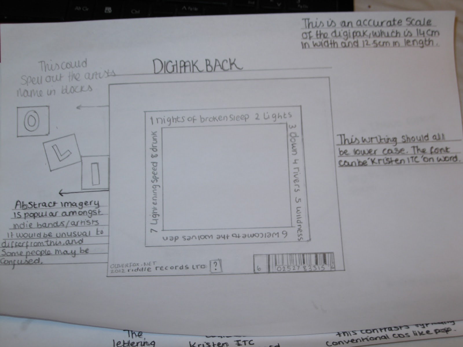
This is a detailed plan of how the digipak will look. (Bear in mind this in an indie artist)

Firstly I have included a plan of what I expect to be on a digipak; this is useful as I can always look back at this, and see if I have missed out anything vital. 
I also have a structure plan of how the digipak will be pieced together and what the panels will have on them. 
In addition I have sketched out the front and back of the digipak, although the images are not on the pages as they will be displayed in the right hand column of this post.

This will be the digipak's front cover.

This may be inserted inside the digipak.


This will be on the back of the digipack, and it will be placed in the middle of the square with the track titles around it.

Wednesday, 25 January 2012

Media in the Online Age Essay


Media in the Online Age

What has been the impact of the internet on media production?

Media production has transformed in recent years, with the majority of old media like newspapers, films, music migrating online.
Firstly newspapers have made the transition from traditional print based media to online; this has had a significant impact on the very survival of this traditional news based institution. As Clay Shirky suggested media would eventually migrate online, this is a notable assumption that is supported with the evidence that in contemporary society most people are internet connected either through computers or smartphones, which makes access an easy and quick resource. This also means that audiences have the opportunity, to contribute online, which has led to the change in their position, from consumers, to producers.
The film industry is another good example, of how the internet has had an impact on production; Netflix in particular has made the tremendous leap into the online age of film, and has made substantial profit from streaming films into the homes of subscribers. This streaming service comes at a fixed monthly price, and offers an unlimited number of films available to customers, which can be downloaded through game consoles, laptops, or just about anything internet connected. It also has zero distribution costs, as the products are transferred via the internet for free; this is the key point about this online company. Profits are high because production and distribution services are completely cut out, and only payment for the copyright of the films is needed, therefore the revenues are extremely high, as long as there is a market. This relates well to the long tail theory.
With the free accessibility of the internet, positive and negative aspects appear in regard to ownership, one example is that creative commons licences protects intellectual property, but this still allows others to remix the material.
Piracy is an important issue that surrounds that internet with controversy. It contributes with substantial losses, which prevents the companies that produced material from receiving the full amount of funds. Individuals sometimes expect things to be free; an example may be that a positive outcome of piracy is that the individual is so eager to hear their favourite artist’s new album that they illegal download it, but also buy it once it’s been officially released. In addition, some individuals may want to illegally download music to see if they like all the songs on an album, they  then may continue on to buy this. On the opposite side on the coin, some people generally expect music to be free, and don’t understand the reason why they have to pay, if they can find it online for free. This also saves them from traditional going to a shop and then purchasing the CD, then downloading it onto their computer, which is a lengthy process, instead of downloading things at home.
In addition, people no longer need to be computer geniuses to find out how to download music, films, games etc., because it’s very simple and quick. The music industry suggests that every single illegal purchase would have been bought otherwise; I find this assumption hard to accept. I think that illegal downloads, whether it be, music, films or games etc. are done so because it’s easy and primarily because it’s free. In the current economic climate some people cannot spend their money on luxuries like music and illegal means is a way of combating this obstacle.

YouTube's Business Model


What is a business model?

Business models are set criteria that are put in place, in order to create structure and plans for a company/business.
This can establish how a company will organise itself, from finance, staff structure, the ideas behind the business, and most importantly how it will make money (Profit).

The business model that I have chosen to research is YouTube; I am initially attracted to this as it would be interesting to find out where their profits come from and if all revenue in fact comes from advertising.

YouTube is a video-sharing website, where users can upload, view and share videos. It was created by three former PayPal employees in February 2005.

Firstly, Advertising has to be the most obvious and widely-accepted model for YouTube. However, within this category, there are several sub-categories, including text ads and video ads. YouTube has developed over the years from text ads to video ads. YouTube also promotes large advertising banners; with links to videos take for example the last Harry Potter premier. In addition YouTube sells slots in their search engine, similar to Google, for example when you type the letter B, Beyonce may come up first because her record company have paid for this type of advertising.

An estimate of YouTube’s revenue hit $825 million in 2010, and will reach $1.3 billion in 2011 and $1.7 billion in 2012; this was taken from Citi analyst Mark Mahaney.

Monday, 2 January 2012

Audience Research feedback


Having conducted a short questionnaire for audience research, I have found a number of great and varied opinions on the names we have come up with for, the solo artist (Oliver Fox), album name (Unrest), song name (Nights of broken sleep), and general tone of the song.

I have summarised and quoted the responses that I received back. The questionnaire was conducted by email, as it was easy to receive a number of responses, fairly quickly.

Firstly these are some comments about the name of the solo indie artist, ‘Oliver Fox’.

‘Fox is a good name, it rolls off the tongue and it is a name I’d remember’

‘His name sounds like it would be popular, and I think he’d be a cool dude!’ 

‘I listen to indie music the most, compared to any other genre, so I’m quite clued up in this area. The name ‘Oliver Fox for an indie solo artist is very inventive, it’s short and easy to remember, which is exactly what you want. It’s very good.’

I asked 10 people the same questions and only 8 people replied, of these 8 people, they all agreed and liked the name Oliver Fox, even those who didn’t particularly like indie music; they still thought it fit well.

Their thoughts on the album name…

‘The album name sounds dramatic, and I would buy it on the shelf, even if I did not know much about the band or artist. Although it would have to have a good cover as well, I think these are the things people look for.’

‘The album name is growing on me, at first I thought it was a bit depressing, but then I looked at it again and found it completely different. It’s vague and open to interpretation which I really like.’

‘I don’t like indie music, but I guess the name sounds good.’  

‘The album name sounds strange, I’m not too sure about it, I guess if the song is about someone who has had their heart broken then ‘Unrest’ is a suitable summary for the album.’

I asked them what they thought of the general tone of the song.

‘The song is appropriate, and ties in well as it says about having a broken heart, and not being able to get out of bed.’

‘Now I think the general tone it positive, things are starting to look up.’

‘I’m a fan of indie music, and I listen to it regularly, Noah + the Whales songs are easy listening. Sometimes people find it hard to understand their plots, but if you produce a good video, then it will be evident.’

‘The tone of the song is upbeat and easy listening; I like this sort of indie music. The album name fits with the genre, I love it.’

‘The song is defiantly not to my taste, because I like heavy rock, so I thought it was a bit boring.’ 

‘I don’t listen to any indie music, I think the song songs depressing if I’m honest, but his name does sound nice.’

Even though some people do not listen to indie music, or they don’t like the genre, their opinions were still valuable and I thought the responses were very detailed and gave me a real feel for the general opinion of the names we have chosen. I feel this research was positive and we as a group should feel confident to carry on using these names.

Wednesday, 14 December 2011

Some storyboard pictures


This is the storyboard Radhika and I made, it hasn't got the best quality images (Sorry Radhika) but we thought we'd get cracking with this process so that we could film. The ideas are all in place and on the back we made a thorough plan of shot for shot of every scene.

Marissa is the truly artistically gifted member of the group, so we also asked her to design a storyboard, which turned out to be amazing. So here's the original one, but it has to be said Marissa's looks more detailed. So i'm going to either grab a link from her page, or do a whole other blog post on it.


Questions for Audience Research


Please listen to the link above, it’s a song by Noah & the Whale, ‘Blue Skies’.

After listening could you answer a few questions, it shouldn’t take long. 
This is for my coursework and I would like some audience feedback.


1)          In your opinion, do you think re-naming the song ‘blue skies’ to ‘Nights of broken sleep’ is appropriate given that the genre is Indie?

2)         Do you listen to Indie music often?


3)         What do you think of the name Oliver Fox for an artist?

4)         Do you like the album name ‘Unrest’?

5)         What do you think of the general tone of the song?

Thank you for your time